What this class is about...
This class is a step up from Graphics I. This class takes the basic skills we learned in the class before, and makes it more second nature while introducing the education and requirements of the job and the job branches. We do anything from designing logos on the computer to printing on shirts and other things. This website will be showcasing all of my work throughout this semester while taking this class. I will be providing writing to explain about the projects along with images of my progress.
_____________________________________________________________________________________________________________________________
Two line design
9/14/20-9/22/20
Project description
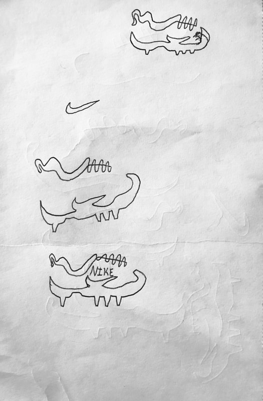
The two line design project is a picture created by using two lines, two different pieces of text, and two colors. Also this project is to be portrayed using the principle of closure. This principle is when something is left open but your brain fills it in because its something that is supposed to be there. I spent around 8 hours on this including the thumbnails, final, and finishing touches.
Thumbnails

|
|

|

|
Ideas for final
- Time
- ideas towards the drawings
- The actual ideas I had and what I was trying to draw
- Technique in these thumbnails
Final copies

|

|
These are the finals for this project. I chose the soccer cleat because I thought it showed the best example of closure. The shoe has a bottom and a top. The bottom consists of the cleats on the bottom, the shape of the sole, and the Nike symbol connected all through one line. The top of the shoe consists of the laces, the opening for your foot, and the loop at the back. Also the two lines of text were to show that they were in fact Nike and the cleat is a soccer cleat. My thought process on this was to show as much of the shoe as possible without making it look like two separate things. I went back and forth adjusting it to make sure it isn't too gaped or too close together. The crazy version of the shoe is the one to the left. This wasn't as crazy as expected as I only did bold and fill to the lettering. At this time I hadn't figured out how to fill the shapes I create with the pen tool resulting in a bad attempt for the crazy version of the final copy.
|
Likes
|
Dislikes
|
________________________________________________________________________________________________________________________________________
Student handbook cover design
9/23/20-10/2/20
Project description
Every year, the South Western School District decides on a Student Handbook and a Commencement cover. I chose the Student Handbook. This project is getting two different sets of eyes: The students in the Graphics I class and the administrators who are deciding actually what is going to be chosen. This project needs a clear representation of the mustang along with a title with the year and the actual title of what type of book we are using. I spent around 12 hours on this including the final and the finishing touches.
Final copy

There were no thumbnails so we did the final right away. I went with the design of a journal. I used anywhere from rectangles to effects on this handbook cover. The black lines on the right side of this design are meant to represent the straps on a dairy or secret journal to keep shut. Another thing on this is the white bar separating the school logo, the mustang, from the school abbreviation. The bottom of the design has a mustang. This mustang was faded using opacity and blur effects on the image. The top of the design has the big SW letters which represent South Western. These letters also have a good amount of effects on them as I included an inner and outer shadow and bold. I also went and put red lines along the black bars where the letters were to give a separated feeling between the letters and the black lines. My final rank the facilitators in the school gave me is second and third best.
|
Likes
|
Dislikes
|
_________________________________________________________________________________________________________________________________________
Saul bass movie poster and poster examples
10/3/20-10/13/20
Project description
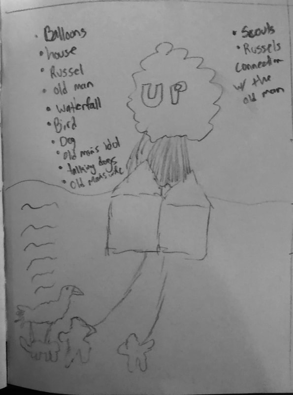
This project was based on the famous graphic artist mostly for movie posters. His posters were big block letters with a lot of reds and oranges. He had simple designs but the designs portrayed a good representation of how the film would look like. This project had two parts. This part was the part where we create our own movie poster with the style of Saul Bass. We had to use only 4 different colors as well as it had to have all main actors and directors. I spent around 14 hours on this including the thumbnails and the final.
Thumbnails

|

|
|

|
Ideas for Final
- Russell
- Old man
- Balloons
- House
- Dog
- Bird
Final copy & color pallet

|

|
This project was meant to be based on Saul Bass' style posters. I chose the movie UP. I decided to create a silhouette of the kid and the balloons. The kid was a main part of this movie as he is arguably the main character of the movie. I made a little bit of color on the balloons to show the depth of them to not just show them fully black. The white lettering on the blue background pops the title out and the black on the blue background for the actors and directors. This is a simple design which is exactly how Bass did his posters. The color pallet was the colors I used for the design and only those colors. I used the pen tool to trace the kid and the shape tool to do the balloons. I spent around 13-14 hours on this.
|
Likes
|
Dislikes
|
Movie poster examples
This project was designed for us to research what type of posters Saul Bass designs and the type of designs he goes for in all of his posters. We researched 8 posters that he created and made some notes for each of them. We said things like when the movie was made, how long the movie was, the actors and directors, the genre, and the likes. The posters above that I chose were chosen because they reached out to me. Saul Bass has plenty more posters these were just the ones that had the coolest design that popped out for me. This took me around 3 hours to do including the slides, the pictures, and the descriptions.
_________________________________________________________________________________________________________________________________________
Book cover
10/16/20-10/27/20
Project description
We chose a book to make a book jacket with. I chose the book Wonder which was a book that I read a lot when I was younger. I had a couple ideas for thumbnails at the time so I decided to choose Wonder. We needed to make all sides and flaps of the jacket. We needed a cover, a author section, critique praise, and a synopsis. We learned how to wrap text around the picture which is helpful for future projects. I spent around 16 hours on this.
Thumbnails

|
|

|
Ideas for final
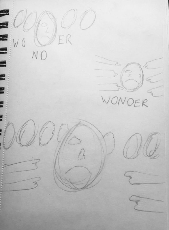
- Wonder eye from the face original cover
- Wonder face from original cover
- Spaceship like the main character wears
- pointing
- humiliation
Final copy
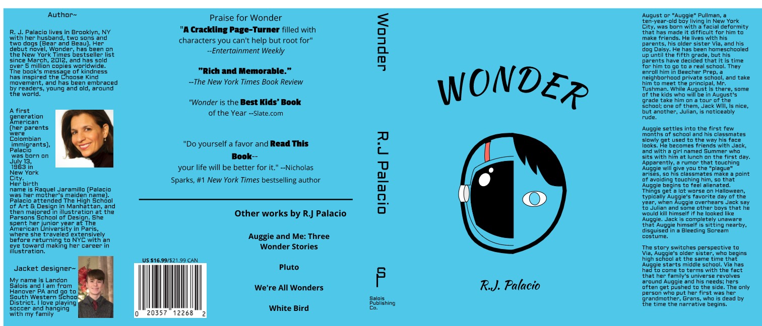
This cover was designed for the book Wonder. I used the blue from the original cover to make it seem more real. I also used the exact picture of the cover along with the critique praise. For the design of the cover I went with a split face representing the split feeling the main character has throughout the story. He wears that helmet to hide his face but the other side is his true face even if he doesn't want people to see it. I made the eye just a little slanted to show the messed up part of his face to show why he doesn't want to show his face. I also didn't include a mouth to symbolize that he doesn't speak about it at all. The writing on the title was curved as is the original cover. This is just a small addition I thought would make it look better.
|
Likes
|
Dislikes
|
_________________________________________________________________________________________________________________________________________
Magazine cover, article, and table of contents
11/1/20-11/16/20
Project description
We were told to use Gravit Designer to create a magazine cover, table of contents, and article. First, I did the cover. This was a cover that used a picture we took ourselves. We also needed a UPC code, price, main article, and a couple sub articles. I used the theme of travel/vacation. Then the table of contents. It also needed a picture and a couple of main segments. The article needed a picture that needed to be taken by us and the text needs to be wrapped around the image. I spent around 21-22 hours on this.
Thumbnails
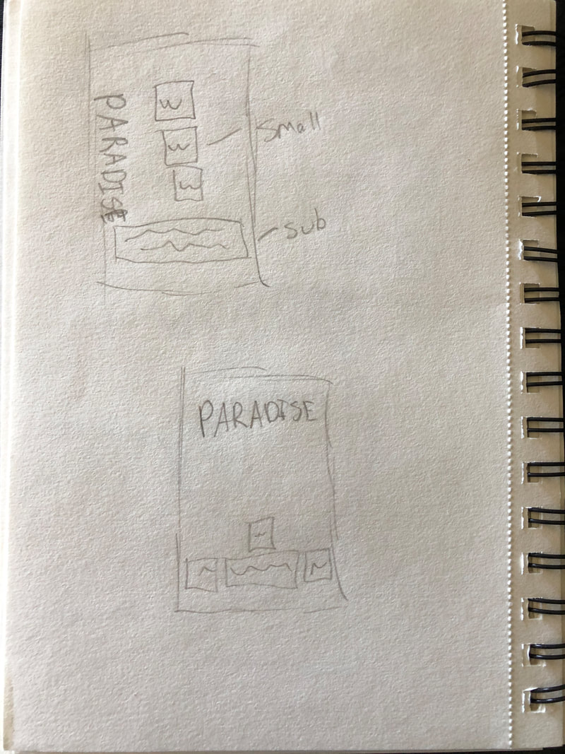
|
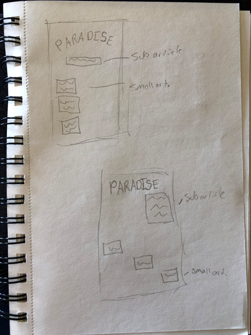
|
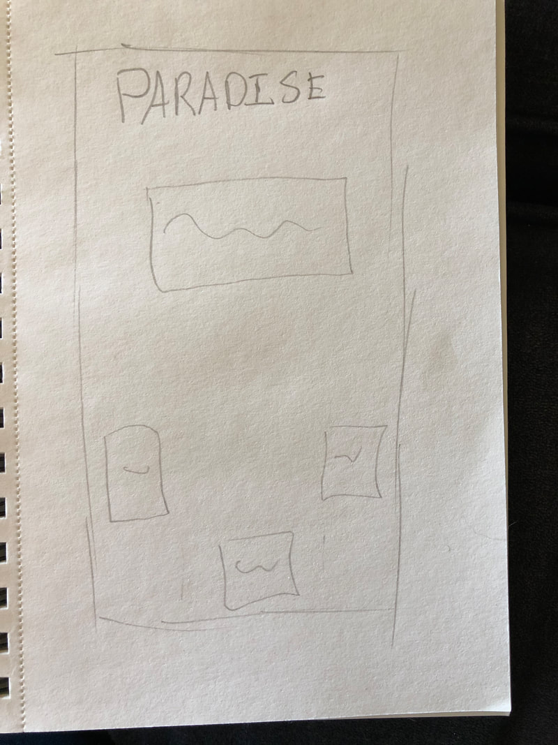
|
Ideas for final
- Beach
- Sand
- Best views
- Ocean
- Restaurants
- Problems in big tourist spots
Final copies

|

|

|
The first thing is the magazine cover. This was a picture I took at vacation near a dock. I used it to portray the vision of beauty in vacation type spots. I used the black lettering along the top because there is sort of a silhouette with the sunset. The font is a fun handwriting font that looks like it would belong in a travel magazine. The table of contents I went for a sunset type theme. I went from red to yellow to act like a sunset. I used a thin font to make it very sleek to see more of the color. The lines also make it sleek to keep the same design. The last one is the magazine article. I used a picture of my ramen noodles and cropped it out using different shapes in the gravit design software. I made it a slightly tinted grey so it doesn't look bland and has some pop to it.
|
Likes
|
Dislikes
|
_________________________________________________________________________________________________________________________________________
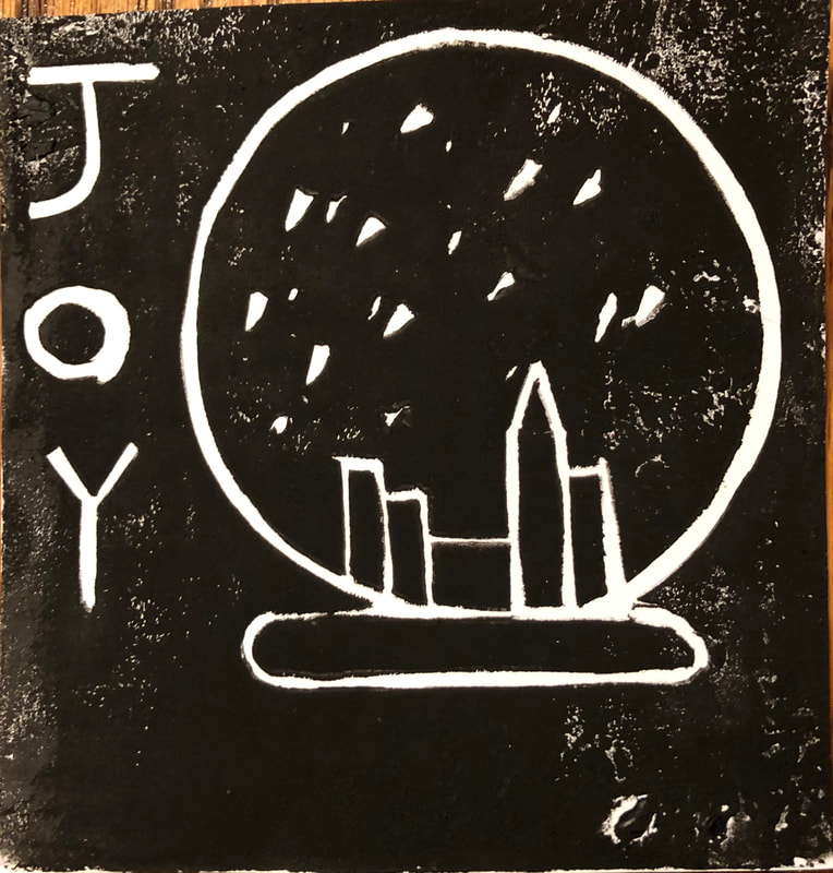
Block printing project
11/22/20-12/6/20
Project description
This project was a new project that we tried. It consisted of a rubber block, a carver for that block, a roller for the ink, the actual ink, and practice pads to practice cutting. This project needed to be a Christmas card and the more copies the better. I did a snow globe which I was inspired by the movie Elf to do the New York style of it. I spent around 18 hours on this.
Thumbnails

Ideas for final
- tree
- presents
- elves
- lights
- cookies
- snow
Final copies & printing block
|

|

|
I chose to do a snow globe inspired by Elf. When I did it, I first went for the round of the globe. I used a shape to trace around since it is difficult to do curves without it. I then added the bottom part by hand since half curves are a little bit easier. I then went in to do the snow. What I did for the snow is dug in straight down decently deep. Then I pulled up and it ripped a chunk out of the block producing a small snowflake. Then I used a ruler to do the city since doing straight lines is also pretty difficult. I finished with the words. I was able to add them after I did the first two copies as I knew it needed something else. I did these hand drawn and as you see on the block, I messed up. I used glue and filled the holes of the mess up and seemed to do the trick.
|
Likes
|
Dislikes
|
_________________________________________________________________________________________________________________________________________
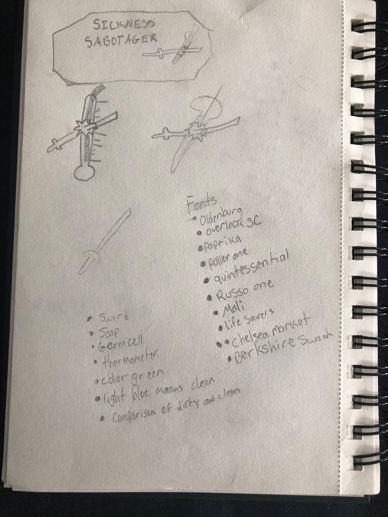
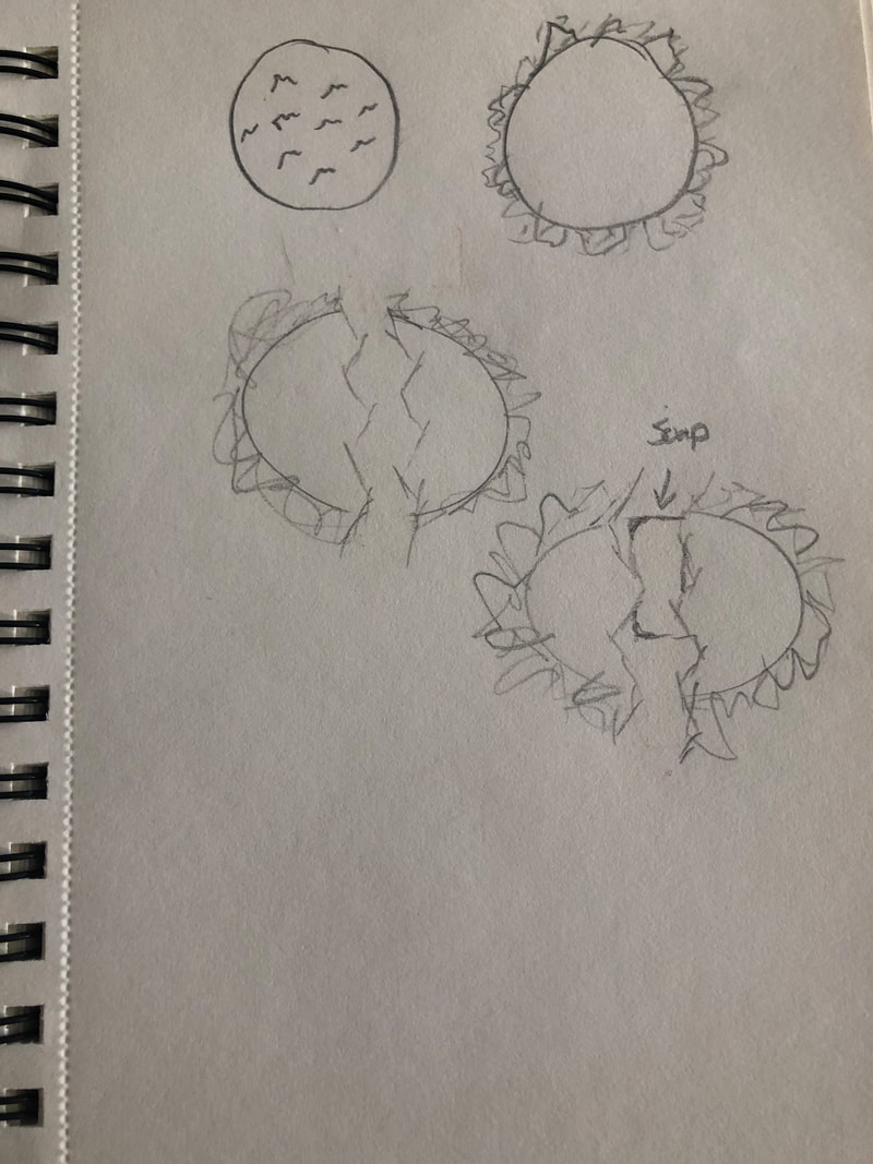
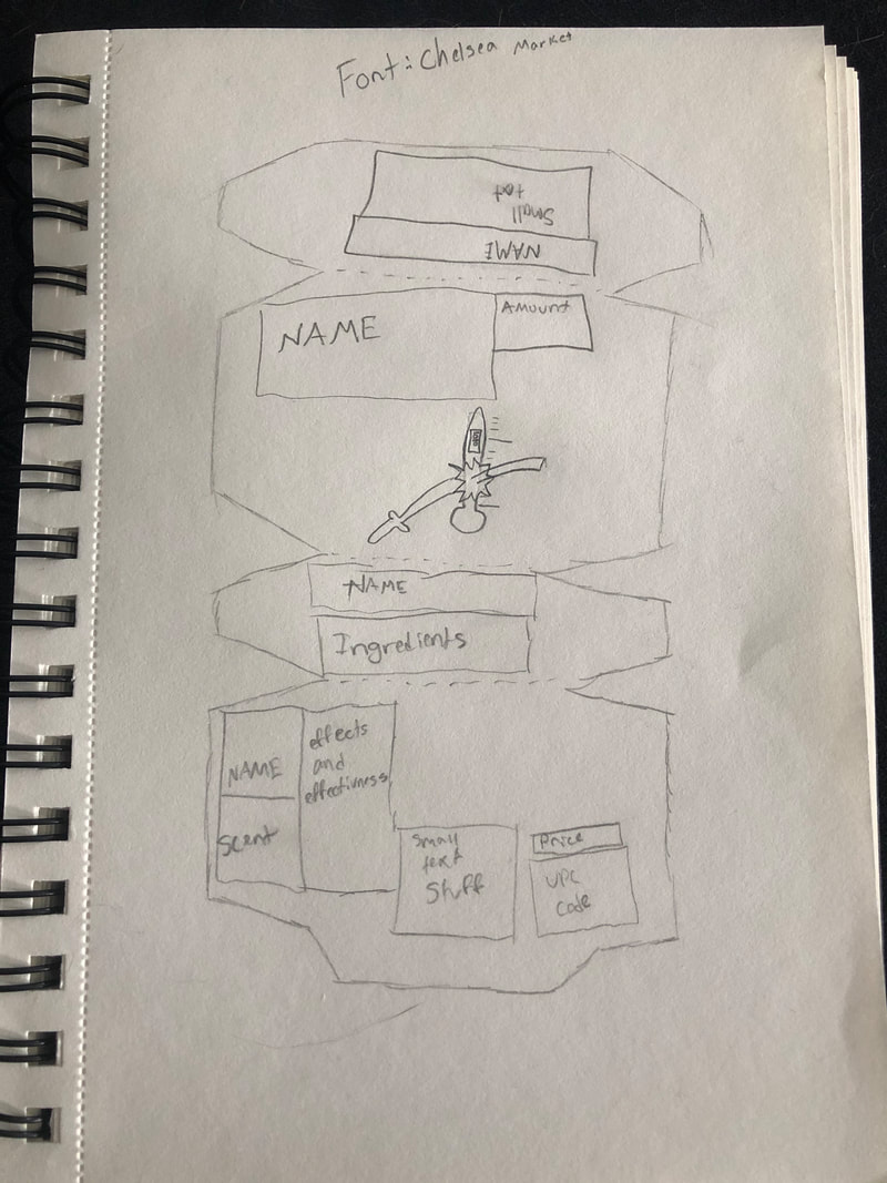
Soap box design project
12/9/20-12/19/20
project description
My project is a soap design based on killing the corona virus. It consists of four flaps. The front cover is where the logo, the name, and the OZ are located. The other three flaps have basic information about the company and the UPC code and price.
Thumbnails & rough draft
|
|
|
Ideas for final
- Sword
- Soap
- Germ cell
- thermometer
- green for sickness
Final copy
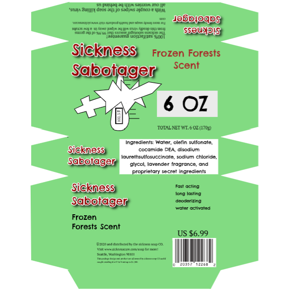
This project is a soap box that we had to design. We got a basic template so all of our boxes looked the same. Then we were given pretty strict requirements about what ingredients were in this soap and where to place all the words on the design. This was a design meant to protect you from corona virus so I went with something that didn't have the word corona in it to make it different to the rest. My design was a sword breaking through a thermometer with a high temperature on it. It was to show that this soap can stop and "sabotage" the corona virus. It took me around 19 hours to complete this.
|
Likes
|
Dislikes
|
_________________________________________________________________________________________________________________________________________
Album cover project
1/4/21-1/8/20
Project description
My project is about an album cover that we thought was cool. We did our best to copy it and try and recreate it using only designs. If there were any images, we had to design it the best we could.
Album cover I chose
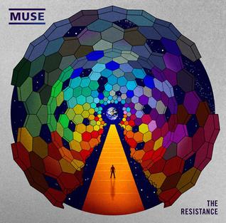
Final copy

This project was made to try and look as close as you could to the original. I used a similar shape to the original to make all the shapes the make up the outside of the circle. I took a bunch of those shapes by using copy and paste. Then I went into the color selection and made each of them a different tone a little similar to the first until I got to the darkest color. Then I added combinations like the three yellows together, then two yellows and a blue, and so on. Then I copied and pasted them until I created a gradient. Then I just traced the guy on the bottom from an image, I used the pen tool to create the walkway by using the gradient tool, and used the pen tool for the white door and then just used the blur tool to blur it.
|
Likes
|
Dislikes
|
_________________________________________________________________________________________________________________________________________
Bus stop billboard
_________________________________________________________________________________________________________________________________________
Tutorials
|

|
These were videos we watched running us through how to do these different things. They are meant to teach us and get us more comfortable with hotkeys and different advanced tools to make things easier and look good. For the tutorials, I used a lot of shapes including the ellipse and the rectangle. I also used the pen tool and a lot of cutting and pasting. Things I learned from these tutorials is if you select the shape you want to go behind and click Ctrl + X and then select the thing that you want to paste behind and click Ctrl + V and it'll paste behind the object you selected. Also small commands like Ctrl + E is for the ellipse and Ctrl + R is the rectangle tool. Once I finished these, I could immediately see a difference in the speed I could do things because of the hotkeys and advanced tools.
